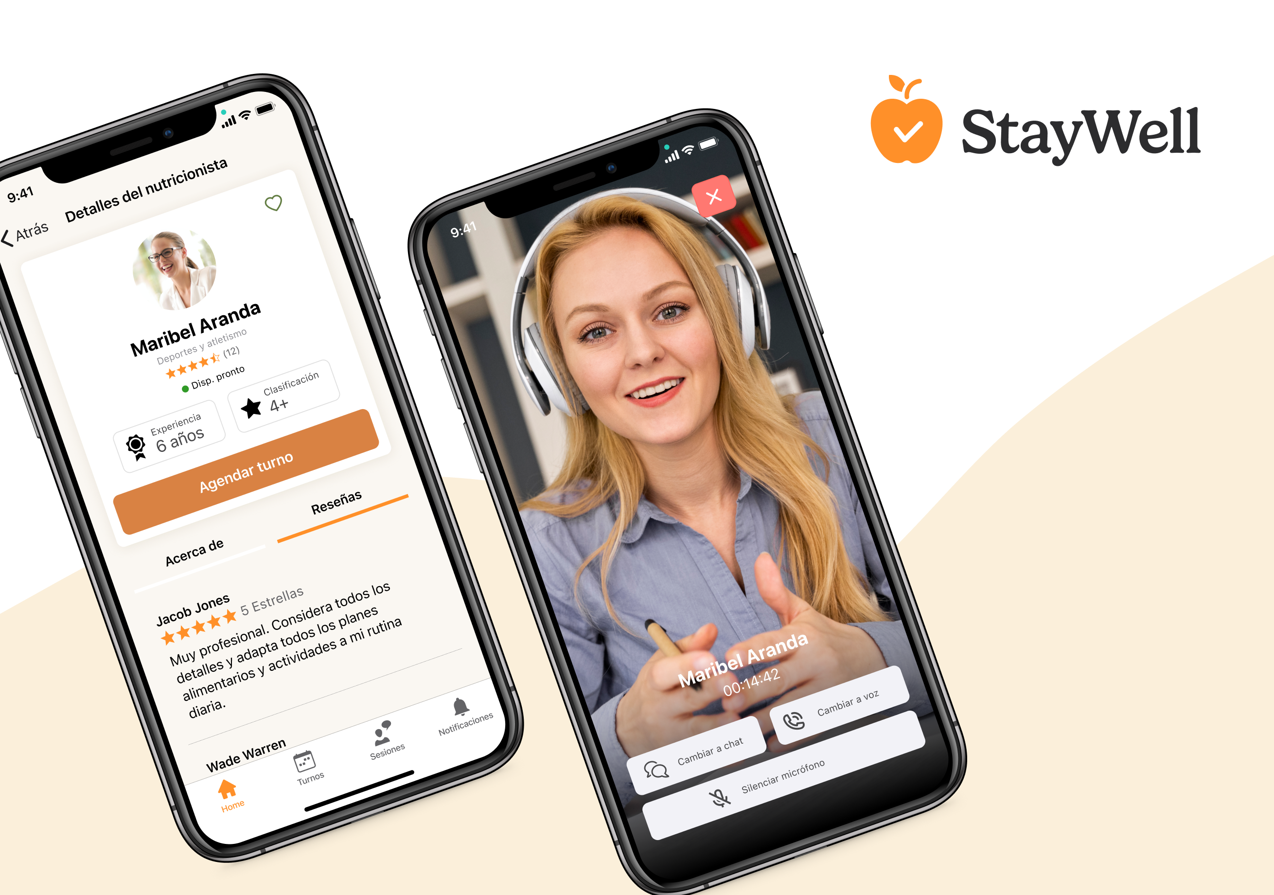
Improved donor database and engagement features
A simple yet powerful donor database for non-profit organizations to monitor donor activity and enable relationship-building, in one place.
What's RallyUp.com
RallyUp is a technology company in the non-profit tech industry that offers an online fundraising solution for organizations and companies of any size to raise funds for good causes and manage their donor base, all in one place.

The product is an interactive fundraising platform that allows its users to create various types of online and in-person fundraising experiences, share them with donors, raise funds, track engagement, and more.
What was the problem
Organizations didn't have enough valuable donor information within the platform to make key decisions due to an outdated software infrastructure.
These users relied on 3rd-party CRM integrations to transfer the data they needed. But managing different platforms, handling integrations configurations, and going back and forth between web apps was a resource-wasting problem users didn't want to have.
There wasn't enough CRM-like functionality in the product to help them take immediate action to increase donor engagement, which was the users' most precious metric. So, as requested, we built it for them.
Who we targeted with this refined functionality
Mid-sized organizations
This segment needed a new way to discover their donor's motivations and behaviour without throwing their "budget" out the window. Often not a 3rd-party CRM user.
Large to enterprise organizations
This segment required more advanced data features including advanced tracking and reporting of donors and their full activity, all within the platform. They were familiar with other CRMs.
Quick snapshot at the evolution of the feature
From a basic table to a full-fledged database
Users could only see names, emails and total donations. That was it. All other important data was missing.
From basic transaction data to full behavioural information
Donation data could only be seen per transaction. Users were forced to see each transaction individually to gain somewhat useful insights from the donors.
The key insights we got from the initial user research efforts
Most of our enterprise-level feature developments start with conversations with our biggest accounts in the form of interviews and through email and document sharing.
We got a few of the largest accounts in calls and started learning what their current workarounds were.
Identified most commonly CRM platforms used by our users
We tried to stick with the most popular ones to get familiar with our users' current environments and to discover opportunities for feature implementation while matching our users' current mental model.
So we identified the following CRM solutions:
We took notes of their own donor databases and profile pages
Our key takeaway
Most of these platforms have a high level of complexity when setting them up as integrations, and their interfaces are not for everyone. And given that our user base demographic prefers simpler, intuitive platforms, we decided to go for a direction that would better fit them.
We wanted to focus on a very simple and intuitive experience to ease the cognitive effort needed to use this new functionality but without compromising on the value provided.
The goals consolidated
After finally defining the main problem - tool complexity and unnecessary integrations for essential donor data - we defined our goals for this project.
The user goal
To ease the process of understanding and engaging with donors at different stages of the relationship-building journey.
The business goal
By offering a more dynamic set of donor data with reduced effort, we were envisioning an overall increase in platform usage tied to our new premium subscription offering, which would ultimately lead to increased revenue by the end of the year.
The defined epic
As a non-profit, I want to learn about who our donors are and understand their giving behaviour so that I have a clear image of when and how to engage with them and what incentivizes them to give more and more often to our causes.
The main challenge
Given that our platform had limited information and limited scalability (due to the outdated infra), and that we needed to ship this relatively fast, we needed to work out a solution that would allow for a more dynamic set of data without refactoring the full existing architecture.
We needed to achieve this by adding new behavioural donor information to the existing dataset that could be better organized, easily accessible, and quickly digestible.
Current data set
Personal & Contact information
New data set
Behavioural & Interaction information
The principles we defined to reach our goal
Intuitive UI is a priority
Provide an intuitive space to store and display essential donor behaviour information, donation activity and key communications tracking with built-in tools to engage with donors within the right context that's easily accessible at any given time.
Provide helpful guidance
Implement an intuitive guided walk-through for first time users of the feature. Since it's a feature within a familiar platform for mostly existing users, we would simply highlight only what's new to them, making the learning experience a breeze.
Powerful, but flexible as well
Deploy a powerful CRM-like feature that won't require the use of 3rd party integrations to achieve the same goal, while still providing the flexibility of integrating with other tools for those advanced users who need a complementary, full-fledged CRM platform anyways.
Shaping the solution
We started experimenting with two new features for our users: a revamped donor database, and a new donor profile panel.
- 1
The Revamped Donor Database
Since we wanted to provide an end-to-end intuitive experience for our users to access their donor data, we decided to completely update the old donor database for a more consistent experience and scalable design approach (this design language was later applied to the rest of the databases throughout the platform).
With this update, we introduced a few new elements and UX quick wins for easier navigation, narrowing down needed data, and easy-to-reach common actions such as bulk emailing supporters.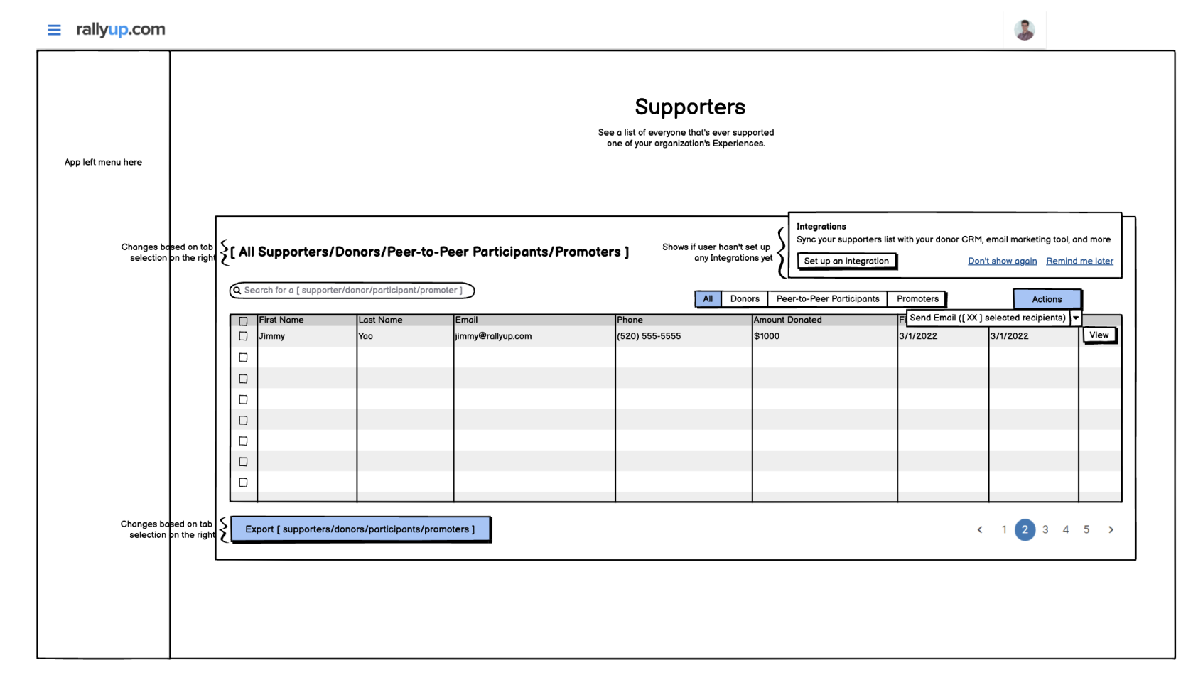
Early wireframe of the revamped donor database - 2
The Donor Profiles
This was the core feature we would offer to our users. It would enable new functionality that was non-existent before alongside more available donor information which would help organizations to better understand and engage their community from a single platform. No more unnecessary complexity headaches.
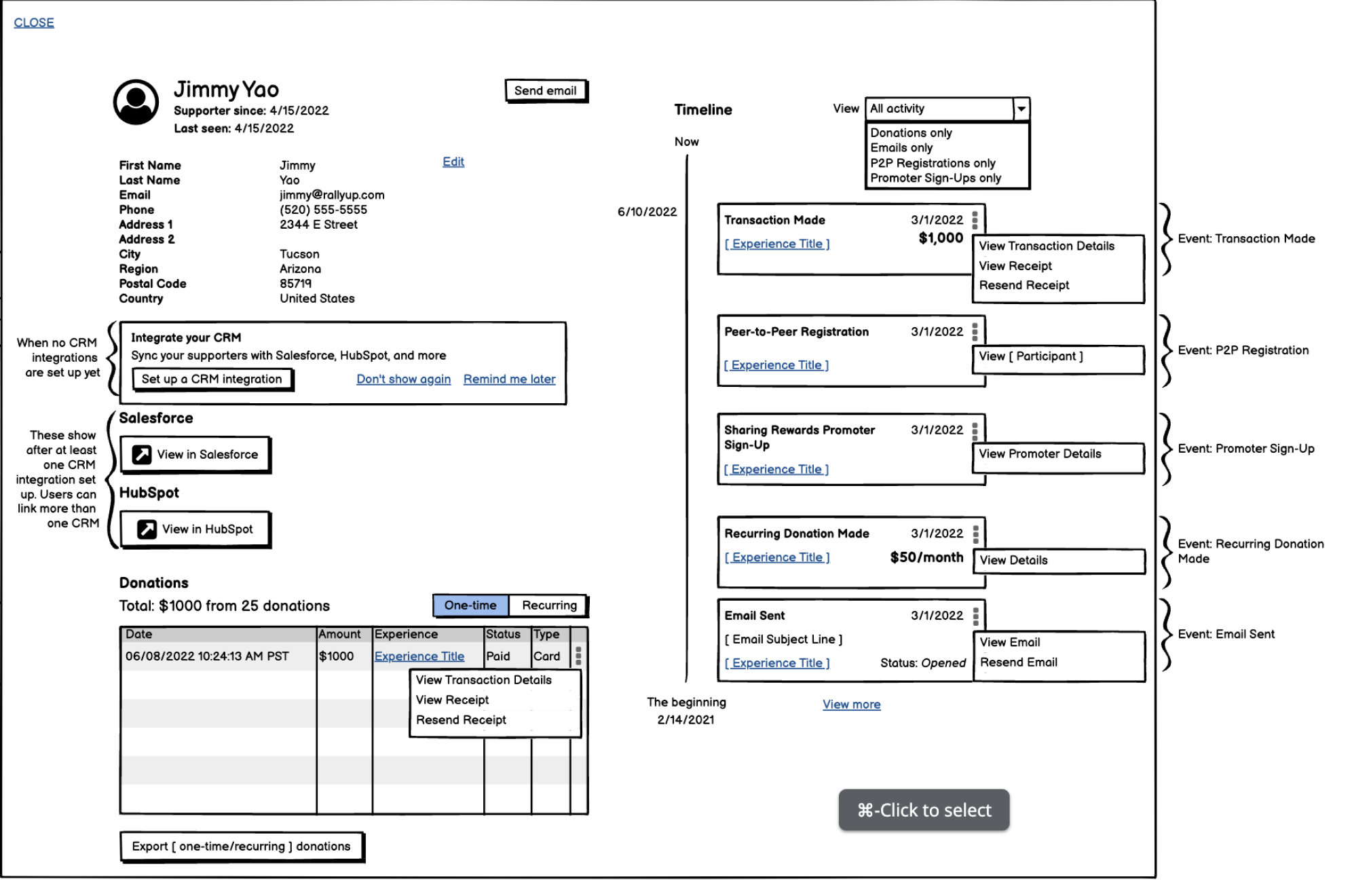
Early wireframe of donor profiles
Important considerations we kept in mind
From our current platform
Items that were impacting the overall experience before shipping the new feature that we needed to account for:
Not great navigation
Donor tables and donations tables were separate pages. This meant that, to see more information about a certain donor, the user was taken to a different page and needed to navigate back and forth between them. Not good. All donor info should live in the same space.
Current mixed flows
The only way to view a donor's donation history was by filtering a global donations database for a whole fundraiser instead of having a proper donor view. This was not ideal for clean navigation and proper donor monitoring. Donors should have their own set of data and own space.
Information architecture could be better
Donation details could only be seen on a global donations database but not on the actual donor tables. We would need a way to consolidate this data under one place for easy access and navigation.
Constrained, not scalable design
Our current database design wouldn't allow for more rich data without starting to get messy. We needed to revisit current components and revamp the database designs for future scalability.
From our existing users
Some limitations we had to work around due to the nature of the demographic of our target market:
Not very tech savvy
Most of our users were not tech savvy. They could get confused or lost with the most basic of patterns on a SaaS platform. We needed an interface friendly and obvious enough (but also robust enough) for users to benefit from the new feature but without overwhelming them.
Older demographic
Most non-profit organizations admins and managers on our user base are from the Gen X to Boomers generation (~40-65) with a traditional mindset about tech. New and modern interaction patterns might be too complicated to understand for fast adoption. So, we tried to keep the patterns they're familiar with already.
Mobile-first users
Despite being a desktop-focused platform due to its complexity, our user base also rely on their mobile devices to perform complex tasks and monitor their fundraisers on certain occasions. This meant that we needed to make sure this new feature performs very well on mobile and it's as close to the desktop experience as possible without compromises.
Device access
We also understood from product analytics that most of our users didn't have access to powerful devices, so we needed to keep in mind performance and speed over a fancy user interface.
The results in detail
Revamped Donor Database
After various explorations, we achieved a good balance between information architecture and intuitiveness. And despite adding a significant amount of new information to the page, it was very digestible and easy to find, even highlighting essential data that wasn't accessible before.
New Donor Profiles
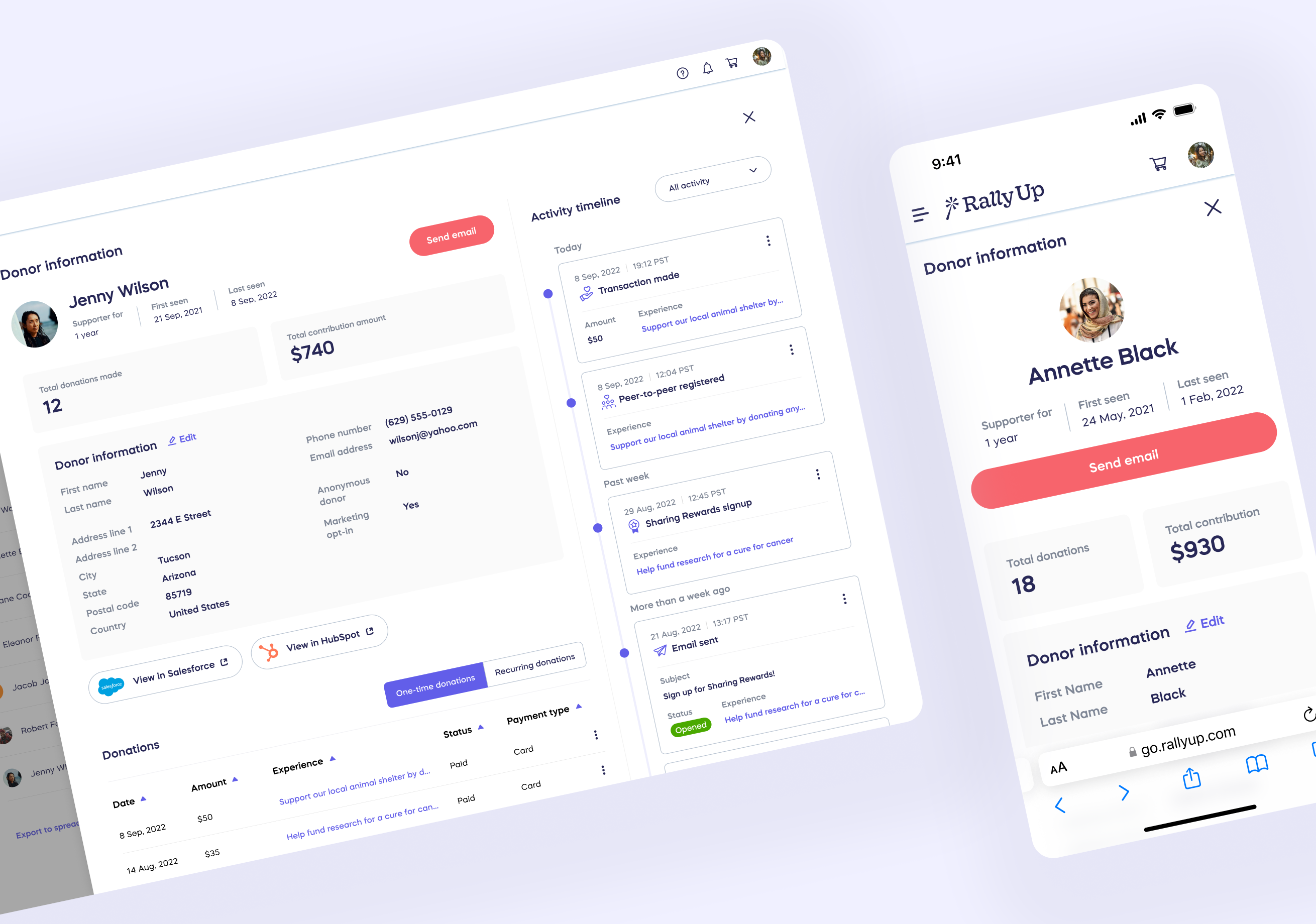
By fully focusing on the principles we defined, we were happy to find a way to display the new behavioural information in a way that's intuitive and flexible without breaking the experience. The overlay drawer solution allowed users to access this information even from other pages in a single click without losing context.
Donor profiles walkthrough on desktop
Donor profiles walkthrough on mobile
Performance analysis after a successful release
Below are some of the main positive highlights from the feature adoption
Increase in premium subscribers (MRR)
Our BizDev folks decided that this highly anticipated and requested feature would be one of the main incentives for our premium subscription package which led to more enterprise users subscribing.
Increase in average donations received
Now that organizations had more ways to understand their donors, they were able to put a better strategy in place that led to more often, higher donations from our users' donor base.
Increase in premium features usage
Since this feature was bundled with other premium features (like full-fledged email marketing capabilities, for instance), users were able to try and leverage these other tools making them more invested in the platform.
We received lots of kudos too
Our customer success team is one of the best (if not the best) in the market and our users appreciate that. And when users are happy, they let us know. And we received a lot of kudos after launch praising the new functionality and the attention to details.
What we were looking forward to
Despite being a successful launch, there were things we had to sacrifice to allow for a faster, more efficient initial release.
We knew this was important for our power-users, so we wanted to keep developing this feature into something great that could compete directly with the big names in the CRM industry. So these are some of the new additions and optimizations we planned to add to the feature in future phases:
Combine donor profiles with our full email marketing capabilities
The email capabilities of the shipped feature were pretty basic but worked. You targeted a donor, opened its profile, and sent an email (or select multiple and send emails in bulk). We wanted to provide more advanced, drip email marketing functionality on the next iterations to allow for more advanced email campaigns.
Add more essential CRM features for an all-in-one experience
Full-fledged CRMs have the advantage of offering very specific features that are used by highly-effective teams. We wanted to bring some of those features to our platform to provide the one platform to do it all.
Allow for more research to discover new opportunities to improve and optimize the experience
Unfortunately, we didn't have the budget or the time for a full research cycle. We were hoping that next time we would invest more resources in this phase to uncover new opportunities to improve the experience with this new feature.
At the end of the day, users appreciated the initial effort that covered most of their needs.
As a user-first product team, we kept in touch with the ones that used the feature the most to keep gathering insights and noting things we could optimize in the following iterations. But as a whole, the feature was a success.